Fast forward... you are at the nursery or online for the first time this year. Your heart rate is picking up speed as you consider the gorgeous vignette you're about to create. This is it! The moment of truth and then you start thinking... these plants are so gosh-darn expensive and, oh boy, I might make a mistake. Panic sets in and you're just a little overwhelmed. You wander aimlessly and give up without making a decision or revert to impulsive shopping... love that one, gotta have it. Here are few tips to help ensure growing and design success...
2. Understand the mature size of the plant. The words "dwarf", "little", and "compact" are relative terms. The plant may be compact relative to other plants within the same genus species. A 4-foot "dwarf" shrub is a big shrub and may be too big for the spot you have in mind. Visualizing the height of the plant relative to your body helps when choosing the right plant for the right spot (i.e. knee=18", hip=3', chest=4', nose=5', etc). If you only have a 2-foot high space under a foundation window, buy a plant that matures at two feet or shorter. 3. Use your photos and/or pull plants together. Yes, literally, pick them up and place them next to one another. If shopping online, create a collage of Google Images with your photos. I do this all the time for my clients, and I make last minute changes to my designs all the time. Sometimes, the plant combinations we've worked out in our heads just don't work in real time. We maximize our chances for design success by creating the combination in the nursery or on the screen before we buy. 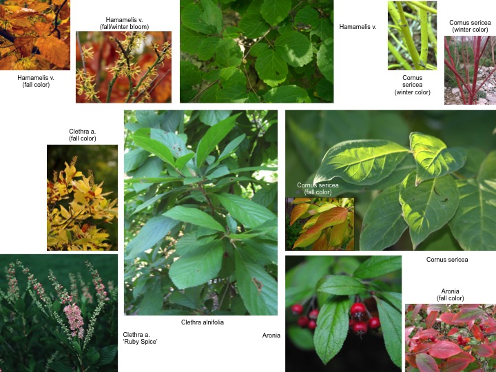 Next time we'll begin to take a look at my favorite native plants in the field. Until then...
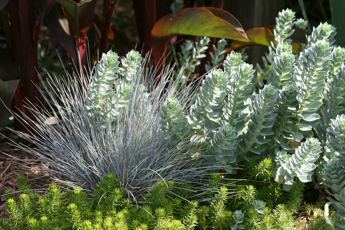
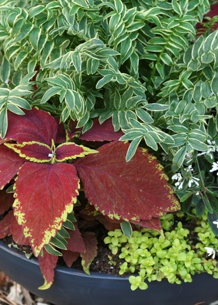
Let's pick up where we left off... If we are planning our gardens so that the plants knit together as they mature (and we should be), then using leaf color and texture to create an appropriate level of contrast for a particular setting is a key to good design. That sounds great, but what does that really mean. Let's look a little closer at one of the pictures from the last journal entry. Let's compare the color picture with the black and white version...  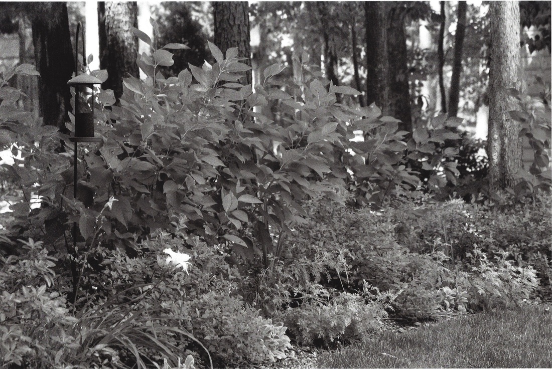 One way to contrast groups of plants is by using leaf color: a dark blue-green leaf next to a chartreuse leaf. However, we can also look at leaf size and texture. All of these things become more apparent when viewed as a black and white print. We start to pay attention to these design elements a little more. This spring I suggest walking your gardens before you head to the nursery, taking pictures of the open areas you'd like to fill, and then, if you can, converting them to gray scale. Remember to include neighboring plants in your viewfinder. Then, think about what type of plant will look good next to the plants that are already there. For example, where you already have a mass of large-leaf plants, shop for a small-leaf plant... 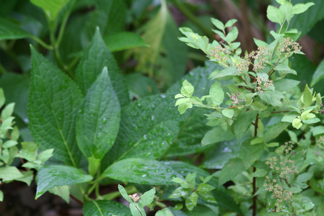 Where you already have small-leaf plants, pick up strappy-leaf plants, such as a grass or daylily... 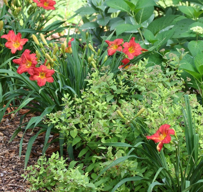 Where you already have solid green leaf, look for a variegated plant... 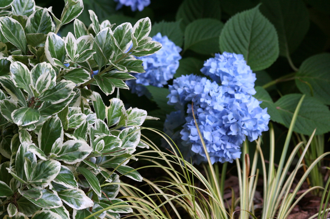 Armed with these mental notes and photos from just a bit of planning before you head to the nurseries will ensure a better shopping experience. If nothing else, you'll be able to justify your buying spree.
Next time we'll discuss how to shop at the nurseries. Until then... My husband had a chuckle over my last blog, specifically regarding the need to determine an open spot in the yard. "Isn't that obvious?" he asked. Believe me, it's not. People buy plants just because they're gorgeous and for no other reason at all. And so we have the definition of impulsive shopping.... "gotta have it." As a designer, how many times have I visited homes with plants that never made into the ground? Lots. There's just no room or the homeowner doesn't quite know how to make the plant fit aesthetically. My hope would be that you have already identified an open spot, which you have studied before you go shopping, and now you're searching for the right plant, which leads me to the subject of this journal entry... Creating Contrast in the Garden. Why are landscapes boring? There's simply not enough contrast between groups of plants. However, having said that... too much contrast and the landscape can become chaotic to the eye. Different settings and whether the gardens will be viewed close up or from far away will dictate the need for more or less contrast. 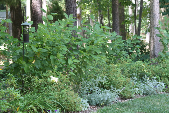
 Next time we'll look at more examples of contrast in the garden. Until then... study the level of contrast you've created in your own yards. Is it too much or not enough?
I love to share landscaping ideas and plant info. What better way to do that than with a journal page. So here we go...
I was a plant lover before a designer. After a tough week, I like nothing better than to spend a Friday afternoon in the nurseries, taking note of new introductions. But this can spell trouble and I know I'm not alone. How do I wander the nurseries without picking up one, three, five, or a carload of plants and then have my husband say, "Did we really need these?" Having spent many years designing gardens for others as well as my own, I have a thought process that may help you decide if your purchase will be right for your yard. I ask myself... Where will I put this new plant? And then, how well will it contrast with its neighbors? If I can successfully answer these questions regarding location and contrast, then I buy. Next, we will explore the importance of an appropriate level of contrast in the garden. Have a great week! |

Karen
Welcome to my journal. For over 20 years I've created original landscape plans to help homeowners increase property value and really enjoy their yards. I approach every project as an unique opportunity to develop a work of living art, one that will require minimal care and age beautifully with time. In this journal, I will share some of my field experiences and tricks of the trade with you. Feel free to email questions. Thanks for visiting.
Archives
February 2019
|
Follow UsCopyright © 2024 Plant More Natives, LLC, Richmond, Virginia. All rights reserved.
|
Customer Care |

|